Working with the Text Class User Interface
From DLXS Documentation
Main Page > Mounting Collections: Class-specific Steps > Mounting a Text Class Collection > Working with the Text Class User Interface
Contents |
Overview: Text Class General Page Layout and Color
Default page delivery in Text Class is done via class-level XSL
stylesheets that are shared by all instances of the class, though
the middleware also supports collection-specific XSL stylesheets
for any or all page-based behavior within the class. All default
Text Class stylesheets are based on the same layout approach,
building tables (along with transparent spacer gifs) for
all positioning and general color or graphic appearance. General
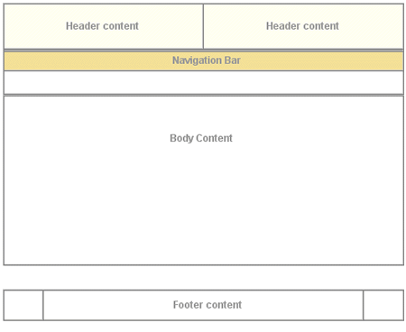
layout of the XSLT-generated HTML is shown in Figure
1
, which shows top-level tables with borders showing,
and using the color scheme for the Voltaire électronique collection.
All table cells for header and navigation bar content at this
level have default values for the
bgcolor attribute for browsers that are not CSS-capable.
Each header and navigation cell also has a default CSS class
value and default background image specified in the background attribute.
The background colors created by class and gif allow for flexibility
to change appearances for different collections based on the
same XSL. For more on specifiying individual collection
appearance, see Customizing Text Class UI Layout.
| Figure 1 : top-level table structure of a typical page. |
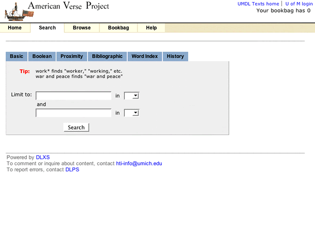
Figure 2 shows the simple search page for The American Verse collection as it appears normally. Navigation bar labels, page text header markup (not header text content, e.g., "Basic Search"), instruction text and footer text are included in the XSL, and thus identical across all collections. All other content is specified per collection by <a href="pis.html">processing instructions</a>.
<p/>
| Figure 2 : Search page for American Verse. |


