Caitlin C Draft Two
From DigitalRhetoricCollaborative
(→Wayfinding) |
(→Modern Digital Usage) |
||
| (20 intermediate revisions not shown.) | |||
| Line 1: | Line 1: | ||
=Wayfinding= | =Wayfinding= | ||
| + | [[Image:Wayfinding.jpg|thumb|right|200px|Finding Your Way]] | ||
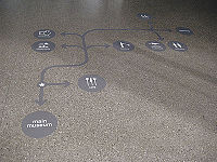
Wayfinding is the use of certain cues to navigate a physical or digital space. It is a termed coined by Kevin Lynch to describe environmental legibility, elements of an environment that allow successful navigation through complex spaces. <ref> [http://webstyleguide.com/wsg3/4-interface-design/2-navigation.html Webstyle Guide to Navigation] </ref> Originally used as a technique for navigating physical environments, it has become applicable in navigation of digital environments and web design. | Wayfinding is the use of certain cues to navigate a physical or digital space. It is a termed coined by Kevin Lynch to describe environmental legibility, elements of an environment that allow successful navigation through complex spaces. <ref> [http://webstyleguide.com/wsg3/4-interface-design/2-navigation.html Webstyle Guide to Navigation] </ref> Originally used as a technique for navigating physical environments, it has become applicable in navigation of digital environments and web design. | ||
| - | + | ||
__TOC__ | __TOC__ | ||
| Line 12: | Line 13: | ||
[[Image:Kevin_A_Lynch.jpg|thumb|left|Kevin A Lynch]] | [[Image:Kevin_A_Lynch.jpg|thumb|left|Kevin A Lynch]] | ||
| - | Wayfinding did not develop until the early 20th century. The term was coined by Kevin Lynch in <i>The Image of the City</i> in which he recognized the importance of an environmental image in wayfinding tasks.<ref>[http://idmaa.org/?post_type=journalarticle&p=1894 International Digital Media and Arts Association on Wayfinding]</ref> He divided the elements of a city into five distinct groups: paths (streets, bus lines, etc), edges (physical barriers such as walls or rivers), districts (places with distinct identities such as Wall Street or the Empire State Building), nodes (major intersections or meeting places), and landmarks (visible structure that can be used to assess orientation over long distances).<ref>[http://webstyleguide.com/wsg3/4-interface-design/2-navigation.html Webstyle Guide to Navigation] </ref> | + | Wayfinding did not develop until the early 20th century. The term was coined by Kevin Lynch in <i>The Image of the City</i> in which he recognized the importance of an environmental image in wayfinding tasks.<ref>[http://idmaa.org/?post_type=journalarticle&p=1894 International Digital Media and Arts Association on Wayfinding]</ref> He divided the elements of a city into five distinct groups: paths (streets, bus lines, etc), edges (physical barriers such as walls or rivers), districts (places with distinct identities such as Wall Street or the Empire State Building), nodes (major intersections or meeting places), and landmarks (visible structure that can be used to assess orientation over long distances).<ref>[http://webstyleguide.com/wsg3/4-interface-design/2-navigation.html Webstyle Guide to Navigation] </ref> Architects, urban planners, landscape architects, environmental graphic designers, and behavioral and cognitive psychologists have contributed to the study of wayfinding.<ref>[http://idmaa.org/?post_type=journalarticle&p=1894 International Digital Media and Arts Association on Wayfinding]</ref> |
==Modern Physical Usage== | ==Modern Physical Usage== | ||
| - | Today, the wayfinding technique is most commonly used in large buildings like hospitals and airports. Signs and architecture are intricately designed with the user in mind. Wayfinding airport designer Jim Harding asserts, "Ultimately, if we do our job well, wayfinding enhances the customer experience without them knowing why or how." <ref>[http://www.theatlantic.com/business/archive/2014/06/how-you-know-where-youre-going-when-youre-in-an-airport/372537/ The Atlantic: How You Know Where You're Going When You're in an Airport]</ref> Every aspect of design is considered from signage, lighting, and color to general architecture of the space. It involves plotting predictable paths and decision points in the signage, so users can easily find their way around in unfamiliar territory. | + | Today, the wayfinding technique is most commonly used for mapping and navigating in large buildings like hospitals and airports. Signs and architecture are intricately designed with the user in mind. Wayfinding airport designer Jim Harding asserts, "Ultimately, if we do our job well, wayfinding enhances the customer experience without them knowing why or how." <ref>[http://www.theatlantic.com/business/archive/2014/06/how-you-know-where-youre-going-when-youre-in-an-airport/372537/ The Atlantic: How You Know Where You're Going When You're in an Airport]</ref> Every aspect of design is considered from signage, lighting, and color to general architecture of the space. Examples of architectural features in airports involved in wayfinding are dual carriageways, escalator, entrances and exits, and check-in counters. They are designed as to be easily located and provide natural signage related to their function.<ref>[http://proxy-remote.galib.uga.edu/login?url=http://search.ebscohost.com/login.aspx?direct=true&db=mzh&AN=2004900716&site=ehost-live Fuller, Gillian. "The Arrow--Directional Semiotics: Wayfinding In Transit." Social Semiotics 12.3 (2002): 231. Academic Search Complete. Web. 12 Apr. 2015.]</ref> It involves plotting predictable paths and decision points in the signage, so users can easily find their way around in unfamiliar territory. |
===Signage=== | ===Signage=== | ||
| + | |||
| + | Signage is a spatial mode of interactivity with the user that transforms unfamiliar terrains with the help of familiar authority such as easily recognizable symbols and titles. Well executed wayfinding signage will allow the user to form a mental map of the space that can be used to inform decisions and action plans. It is vital that all signage can be easily understood by a wide variety of users and can be seen from an acceptable distance.<ref>[http://proxy-remote.galib.uga.edu/login?url=http://search.ebscohost.com/login.aspx?direct=true&db=mzh&AN=2004900716&site=ehost-live Fuller, Gillian. "The Arrow--Directional Semiotics: Wayfinding In Transit." Social Semiotics 12.3 (2002): 231. Academic Search Complete. Web. 12 Apr. 2015.]</ref> | ||
====The Arrow==== | ====The Arrow==== | ||
| - | The arrow is a tool in signage that helps to control movement and maintain stability. | + | [[Image:arrow.gif|thumb|right|200px|Sign with Arrow]] |
| + | |||
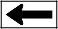
| + | The arrow is a tool in signage that helps to control movement and maintain stability. It guides the person in a specific direction, and the person becomes a traveler guided directly by specific procedures for movement. The arrow essentially transforms information in a certain order or direction. When the space is planned in the way a map is planned, the signs are less about representation and more about movement and directionality. The arrow, specifically, is a tool for guiding movement and behavior in an unfamiliar space. All the person needs to do is follow the arrows in order to get to a specific place.<ref>[http://proxy-remote.galib.uga.edu/login?url=http://search.ebscohost.com/login.aspx?direct=true&db=mzh&AN=2004900716&site=ehost-live Fuller, Gillian. "The Arrow--Directional Semiotics: Wayfinding In Transit." Social Semiotics 12.3 (2002): 231. Academic Search Complete. Web. 12 Apr. 2015.]</ref> | ||
==Modern Digital Usage== | ==Modern Digital Usage== | ||
| + | |||
| + | There are certain distinctions between physical wayfinding and wayfinding in digital spaces. Wayfinding in [[digital media]] is used in navigation and [[usability]] heavily connected to [[spatial affordance]] and [[procedural affordance]]. In digital spaces, there is no sense of scale or movement, no compass, no directions or clear sense of going in a certain direction.<ref> [http://webstyleguide.com/wsg3/4-interface-design/2-navigation.html Webstyle Guide to Navigation] </ref> In order to aid this wayfinding cues are embedded into the space to keep users aware of where they are and where they might want to go. Like in physical spaces, arrows are used to direct a user to what they should click on. Home pages, [http://www.nngroup.com/articles/breadcrumb-navigation-useful/ breadcrumbs] <ref>[http://www.nngroup.com/articles/breadcrumb-navigation-useful/ Nielsen and Norman on Breadcrumbs]</ref> (reminders of visitation), and color changing links give a sense of orientation to the user. <ref>[http://webstyleguide.com/wsg3/4-interface-design/2-navigation.html Webstyle Guide to Navigation] </ref> It is particularly useful when the user is [http://www.nngroup.com/articles/deep-linking-is-good-linking/ deeplinked] <ref>[http://www.nngroup.com/articles/deep-linking-is-good-linking/ Nielsen and Norman on Deeplinking]</ref> (clicking on a link from an email or other separate system into the deeper aspects of the website) far into the site or use the search function instead of going through the normal hierarchy of the site. Clear and consistent navigation is how users find information and helps them to remember which site areas they have already visited. <ref>[http://www.nngroup.com/articles/intranet-information-architecture-ia/ Nielsen and Norman Group on IA]</ref> | ||
===Navigation and Usability=== | ===Navigation and Usability=== | ||
| + | [[Image:drop-down-menu.jpg|thumb|left|350px|Drop Down Menu]] | ||
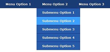
| + | Interface design is consistent with each page looking similar enough that the user knows it is still the same site. Navigation is directly linked to menu bars and search bars. More maximum [[usability]] both a navigation menu or browsing option and a search bar is included. [http://en.wikipedia.org/wiki/Breadcrumb_(navigation) Breadcrumbs] <ref>[http://en.wikipedia.org/wiki/Breadcrumb_(navigation) Breadcrumbs Wikipedia]</ref> are reminders about what has been previously visited or current position in the site. Some examples are color changing links that change after they have been clicked on, tabs that change color when visited, and a home option that maintains orientation for the whole site. | ||
| + | Lynch's terminology has been applied to the digital space. Districts and edges (pages) are consistent with each other but still distinguishable. Nodes (interactive elements) provide choices but do not overwhelm the user. Landmarks (home page, etc) are consistently placed on each page to maintain orientation. Paths ([http://en.wikipedia.org/wiki/Breadcrumb_(navigation) breadcrumbs] <ref>[http://en.wikipedia.org/wiki/Breadcrumb_(navigation) Breadcrumbs Wikipedia]</ref>) are consistent, well-marked, and easily discernible for the user. Just like in a physical space, there are cues throughout the site to remind users where they are and how they can get where they need to go. | ||
==References== | ==References== | ||
<references/> | <references/> | ||
Current revision
[edit] Wayfinding
Wayfinding is the use of certain cues to navigate a physical or digital space. It is a termed coined by Kevin Lynch to describe environmental legibility, elements of an environment that allow successful navigation through complex spaces. [1] Originally used as a technique for navigating physical environments, it has become applicable in navigation of digital environments and web design.
Contents |
[edit] History
Wayfinding did not develop until the early 20th century. The term was coined by Kevin Lynch in The Image of the City in which he recognized the importance of an environmental image in wayfinding tasks.[2] He divided the elements of a city into five distinct groups: paths (streets, bus lines, etc), edges (physical barriers such as walls or rivers), districts (places with distinct identities such as Wall Street or the Empire State Building), nodes (major intersections or meeting places), and landmarks (visible structure that can be used to assess orientation over long distances).[3] Architects, urban planners, landscape architects, environmental graphic designers, and behavioral and cognitive psychologists have contributed to the study of wayfinding.[4]
[edit] Modern Physical Usage
Today, the wayfinding technique is most commonly used for mapping and navigating in large buildings like hospitals and airports. Signs and architecture are intricately designed with the user in mind. Wayfinding airport designer Jim Harding asserts, "Ultimately, if we do our job well, wayfinding enhances the customer experience without them knowing why or how." [5] Every aspect of design is considered from signage, lighting, and color to general architecture of the space. Examples of architectural features in airports involved in wayfinding are dual carriageways, escalator, entrances and exits, and check-in counters. They are designed as to be easily located and provide natural signage related to their function.[6] It involves plotting predictable paths and decision points in the signage, so users can easily find their way around in unfamiliar territory.
[edit] Signage
Signage is a spatial mode of interactivity with the user that transforms unfamiliar terrains with the help of familiar authority such as easily recognizable symbols and titles. Well executed wayfinding signage will allow the user to form a mental map of the space that can be used to inform decisions and action plans. It is vital that all signage can be easily understood by a wide variety of users and can be seen from an acceptable distance.[7]
[edit] The Arrow
The arrow is a tool in signage that helps to control movement and maintain stability. It guides the person in a specific direction, and the person becomes a traveler guided directly by specific procedures for movement. The arrow essentially transforms information in a certain order or direction. When the space is planned in the way a map is planned, the signs are less about representation and more about movement and directionality. The arrow, specifically, is a tool for guiding movement and behavior in an unfamiliar space. All the person needs to do is follow the arrows in order to get to a specific place.[8]
[edit] Modern Digital Usage
There are certain distinctions between physical wayfinding and wayfinding in digital spaces. Wayfinding in digital media is used in navigation and usability heavily connected to spatial affordance and procedural affordance. In digital spaces, there is no sense of scale or movement, no compass, no directions or clear sense of going in a certain direction.[9] In order to aid this wayfinding cues are embedded into the space to keep users aware of where they are and where they might want to go. Like in physical spaces, arrows are used to direct a user to what they should click on. Home pages, breadcrumbs [10] (reminders of visitation), and color changing links give a sense of orientation to the user. [11] It is particularly useful when the user is deeplinked [12] (clicking on a link from an email or other separate system into the deeper aspects of the website) far into the site or use the search function instead of going through the normal hierarchy of the site. Clear and consistent navigation is how users find information and helps them to remember which site areas they have already visited. [13]
[edit] Navigation and Usability
Interface design is consistent with each page looking similar enough that the user knows it is still the same site. Navigation is directly linked to menu bars and search bars. More maximum usability both a navigation menu or browsing option and a search bar is included. Breadcrumbs [14] are reminders about what has been previously visited or current position in the site. Some examples are color changing links that change after they have been clicked on, tabs that change color when visited, and a home option that maintains orientation for the whole site.
Lynch's terminology has been applied to the digital space. Districts and edges (pages) are consistent with each other but still distinguishable. Nodes (interactive elements) provide choices but do not overwhelm the user. Landmarks (home page, etc) are consistently placed on each page to maintain orientation. Paths (breadcrumbs [15]) are consistent, well-marked, and easily discernible for the user. Just like in a physical space, there are cues throughout the site to remind users where they are and how they can get where they need to go.
[edit] References
- ↑ Webstyle Guide to Navigation
- ↑ International Digital Media and Arts Association on Wayfinding
- ↑ Webstyle Guide to Navigation
- ↑ International Digital Media and Arts Association on Wayfinding
- ↑ The Atlantic: How You Know Where You're Going When You're in an Airport
- ↑ Fuller, Gillian. "The Arrow--Directional Semiotics: Wayfinding In Transit." Social Semiotics 12.3 (2002): 231. Academic Search Complete. Web. 12 Apr. 2015.
- ↑ Fuller, Gillian. "The Arrow--Directional Semiotics: Wayfinding In Transit." Social Semiotics 12.3 (2002): 231. Academic Search Complete. Web. 12 Apr. 2015.
- ↑ Fuller, Gillian. "The Arrow--Directional Semiotics: Wayfinding In Transit." Social Semiotics 12.3 (2002): 231. Academic Search Complete. Web. 12 Apr. 2015.
- ↑ Webstyle Guide to Navigation
- ↑ Nielsen and Norman on Breadcrumbs
- ↑ Webstyle Guide to Navigation
- ↑ Nielsen and Norman on Deeplinking
- ↑ Nielsen and Norman Group on IA
- ↑ Breadcrumbs Wikipedia
- ↑ Breadcrumbs Wikipedia


